Recently added to the catalogue is a large type specimen book produced as a trade catalogue for the Lettergieterij “Amsterdam” (F191.b.5.1). This Dutch type foundry was established in Rotterdam by Nicolaas Tetterode, before moving several years later to Amsterdam, where from 1901 it was located on the Bilderdijkstraat. In the early 20th century the firm designed a number of original typefaces. The lavish catalogue, on high quality paper, is not dated, but is assumed to have been issued in 1919 on the basis of its reproductions of advertisements. The introductory matter is in both Dutch and French, and clients are respectfully requested not to remove pages or cut out examples –
Bij bestelling gelieve men dit boek niet te verminken, door het uitscheuren van bladen.
Unfortunately a previous owner of Cambridge’s copy has disregarded that request, and chopped out part of page 351/352.

The catalogue begins with a sequence of photographs of the factory and showrooms in Amsterdam.
There follow short texts in a wide variety of typefaces and sizes, including Electa, Firenze, Amstel, Romaansch, Elzevier and Plantin. The examples given for Cheltenham include three lines in 48 point, announcing that the printer is probably one of the most abused men on earth.

The examples are in a wide range of languages – Dutch, English, French, German, Italian, Latin, Spanish, Swedish – suggestive of the international nature of the firm’s business.

The next section gives longer textual examples in a variety of sizes and spacings, and then follows a grouping of short texts by size, each accompanied by lines of typographically compatible bolds and italics in various typefaces.
A substantial sequence of what are described as “fantasy types” gives a wide range of sample advertising compositions, as exemplified in our image for French linen and the Auto-car journal, both in Cheltenham.
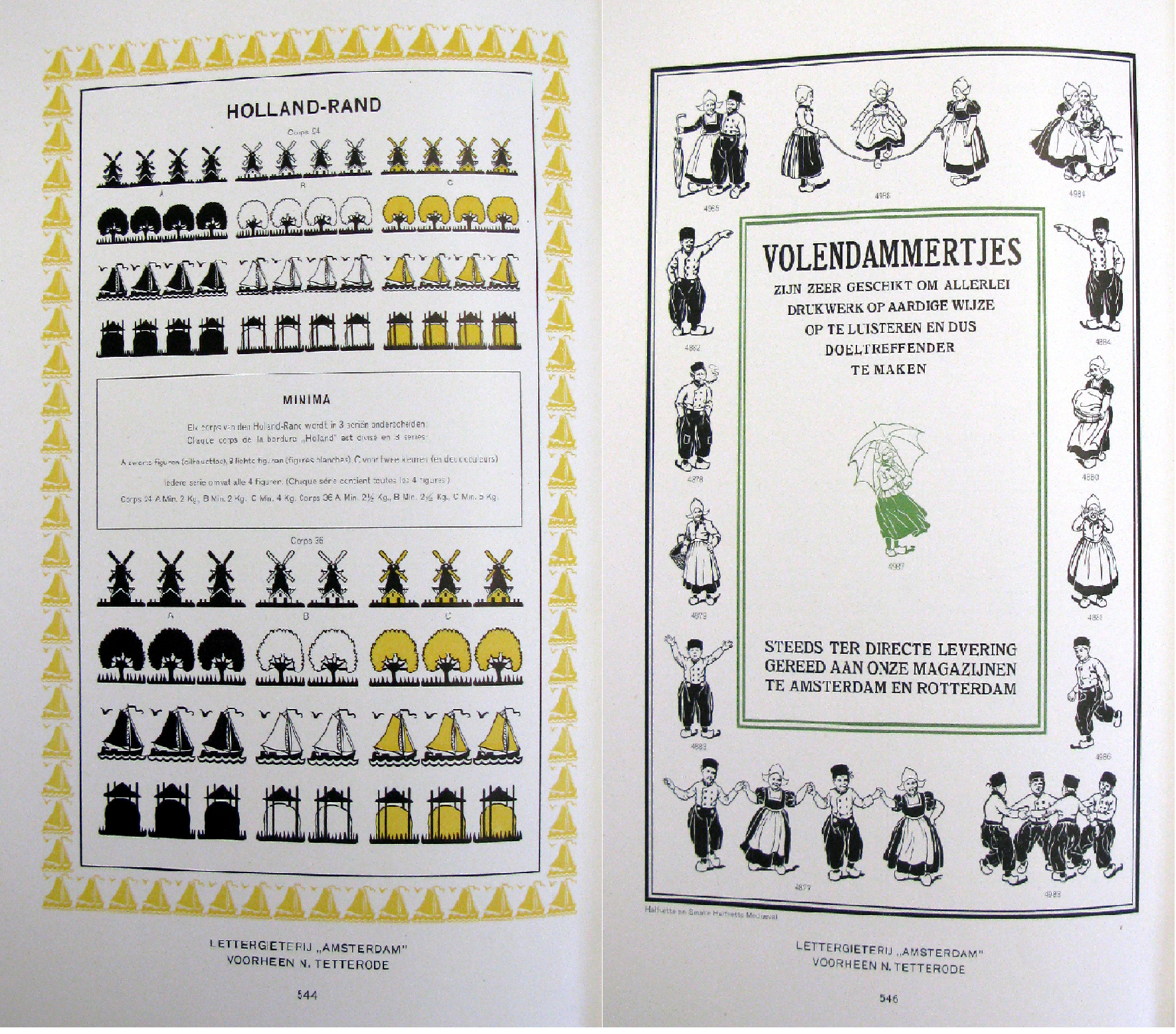
The section on borders and ornaments includes many examples made up into sample compositions, and here colour becomes a more significant element. Charming borders of windmills and children in traditional Dutch costume remind us that we are dealing with a Dutch type foundry.

With hindsight the page illustrating an edging of swastikas has slightly more sinister overtones, although in 1919 it was still most commonly used as a symbol of good luck and auspiciousness, not being formally adopted by the Nazi party until 1920.

The final section of the trade catalogue, devoted to German Fraktur and oriental typefaces, gives another indication of the international flavour of the Lettergieterij “Amsterdam”’s business. There are examples of Coptic, Syriac, Hebrew, Chinese and Japanese, but also, and slightly more surprising, a range of Austronesian languages. The catalogue concludes with three pages of the Batak script used in Sumatra.
Cambridge’s copy of the trade catalogue is also well travelled. Printed in Holland, the preliminaries are stamped with the name of a Swedish publisher, H. Halls Boktryckeri-Aktiebolag of Jönköping. We in turn acquired it from Oak Knoll Books, an antiquarian book dealer based in New Castle, Delaware.
David Lowe
